
Choosing the Perfect Color Palette for Sophisticated Home Decor
- Chateau Charmant Interiors
- Jul 26, 2025
- 4 min read
Updated: Aug 4, 2025
Decorating your home with the right colors is an exciting yet challenging task. The colors you choose can significantly influence your mood and create a lasting impression. While many homeowners lean toward trendy neutrals, there’s a world of rich and sophisticated colors waiting to be explored. In this guide, we will look at how to select the perfect colors, the smart use of secondary and tertiary colors, and the effective incorporation of black into your decor—all while steering clear of the beige decor trap and embracing an elegant style inspired by grand estates.
Understanding Color Theory
Grasping basic color theory is essential before diving into selection. The color wheel includes primary colors (red, blue, and yellow), secondary colors (green, orange, and purple), and tertiary colors, which blend primary and secondary colors. By leveraging this knowledge, you can create a lively color palette that looks beautiful together.
Complementary Colors: Colors opposite each other on the wheel stand out when paired together, like blue and orange.
Analogous Colors: Located next to each other, these colors create a subtle yet harmonious look. For instance, blue and green together can bring tranquility to a space.
The Importance of a Color Palette
A cohesive color palette is crucial for sophisticated home decor. Start with a dominant color that sets the mood, then add complementary secondary and tertiary hues to enrich the design.
For example, if deep navy blue becomes your primary choice, pair it with warm gold as a secondary color and soft gray for a tertiary touch. This combination not only feels upscale but can also transform a room into a refined space reminiscent of classic design.
Incorporating Secondary and Tertiary Colors
Primary colors can grab attention, while secondary and tertiary colors add nuances that enhance your decor.
Imagine a living room painted in soft sage green. You might introduce vintage rose and muted mustard as secondary colors. You could add decorative pillows and artwork that showcase these tones, creating a lively atmosphere without overwhelming the space.
For a study with rich mahogany furniture, you might incorporate tertiary colors like burnt orange and cool teal. A statement rug blending these shades can neatly define the area while maintaining an elegant feel.
The Art of Using Black
Incorporating black can be tricky, as it can often make spaces feel smaller. However, when done right, black can impart sophistication and depth to your interiors.
Instead of making black the main color, use it as an accent. A glossy black frame around artwork can highlight the pieces effectively. Consider adding sleek black furniture, such as a modern coffee table or stylish side chairs, which can ground a room while keeping it light.
For instance, picture a dining room with warm cream walls and a dark mahogany table surrounded by black chairs. This setup not only avoids blandness but also elevates the space's sophistication, evoking a sense of refinement often associated with luxury dining halls.

Avoiding the Beige Decor Trap
While neutrals provide a soothing background, sticking to only beige can lead to dullness. This "beige decor trap" risks rendering your home uninspiring.
Start with a neutral base like beige walls, but enrich the space with vibrant textiles and decor elements. Adding bolder colors through art, throw pillows, and decorative objects can help infuse life into your home. For example, a vibrant teal throw blanket draped over a beige sofa can create an enticing focal point.
Textures matter, too. Use a woven basket, soft velvet cushions, or a unique piece of art to add depth and interest. This layering will make your home feel warm and inviting.
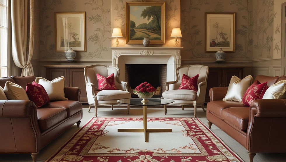
Traditional Decor with Upscale Sophistication
Traditional decor often features rich colors, like emerald green, sapphire blue, and warm burgundy, that exude luxury.
To bring a castle-like ambiance to your home, consider using these jewel tones in rich drapes layered with lighter shades for contrast. A plush area rug featuring ornate patterns can not only warm up the space but also ground your overall color scheme.
Textures are just as important. By mixing velvet, silk, and elegantly finished wood, you create a refined atmosphere. Envision a deep red velvet couch paired with gold accents and antique wood items to form a luxurious sitting area that invites conversation and relaxation.
Final Thoughts
Choosing colors for your home is an enriching experience that involves understanding color theory, creating a well-coordinated palette, and smartly using secondary and tertiary colors. By using black as a strategic accent and avoiding the beige decor trap, you can keep your living space vibrant and welcoming.
With traditional styles that suggest elegance and charm, you can design a home that’s not only visually stunning but also expresses your individuality. The secrets lie in balancing colors, textures, and layering to turn your residence into an upscale haven.
Creating sophisticated decor is a journey, full of opportunities to showcase beauty and personal expression. For further guidance, just contact us:
bryan@chateaucharmant.com or text 281-216-3662
Ready for more? Peruse our other blog posts here.


Comments